Period correct "E9" type face or font for t-shirt

Stevehose

Well-Known Member
Site Donor $$
Messages
13,002
Reaction score
5,679
Location
Sarasota, FL
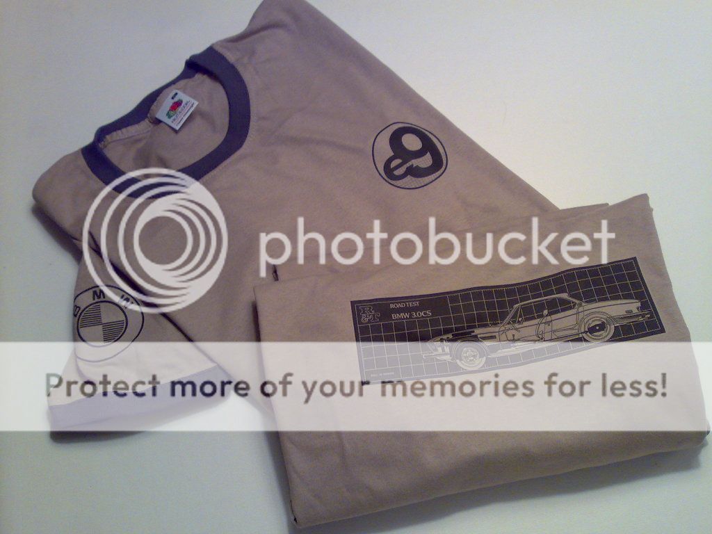
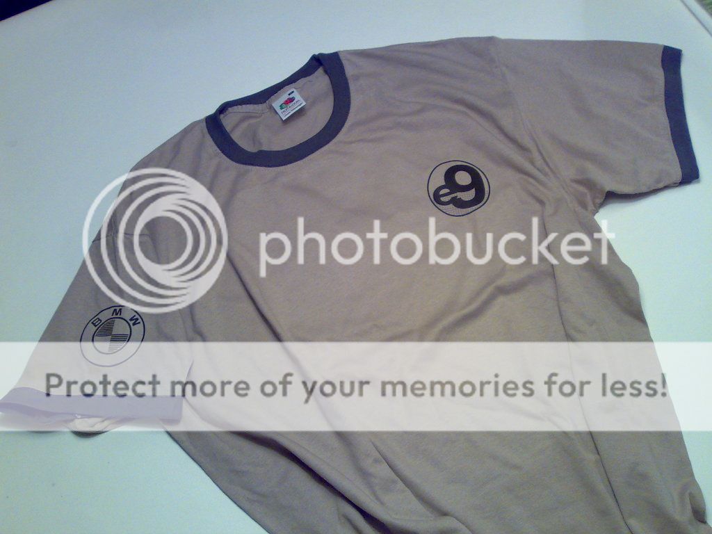
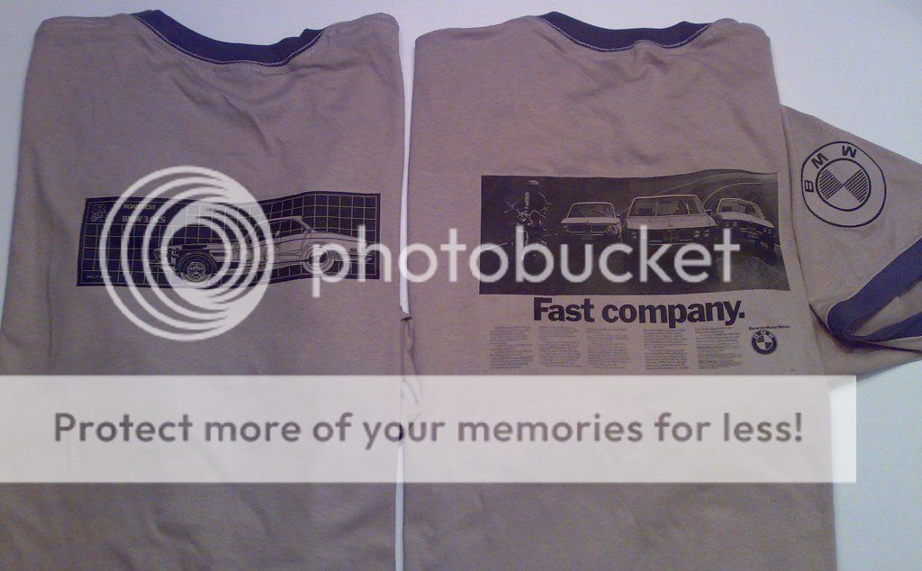
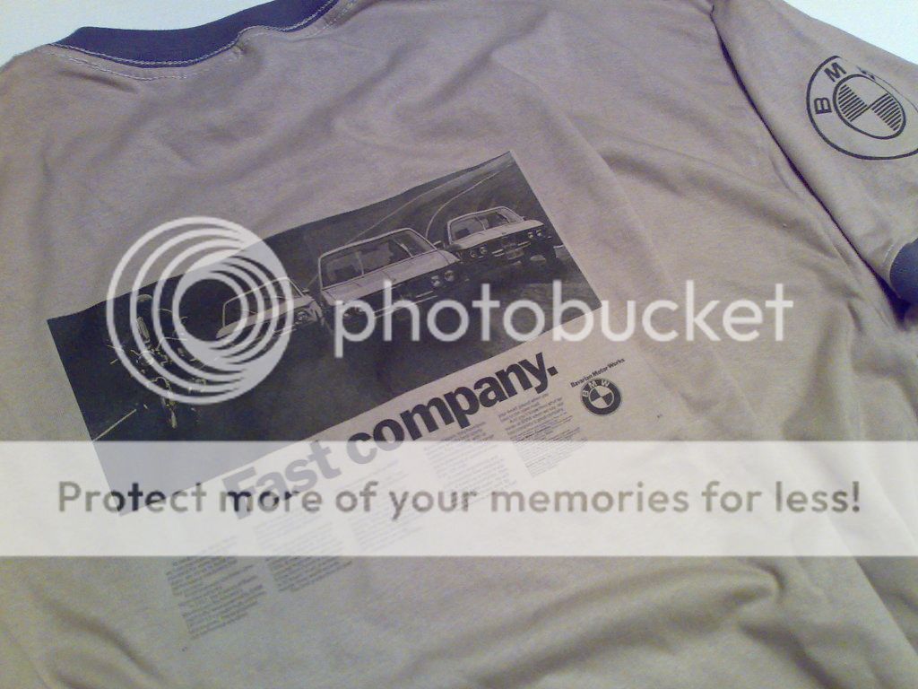
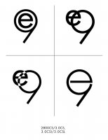
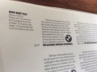
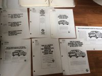
I'd like to make some t-shirts with a subtle "E9" logo of some sort, does anyone have any old brochures or catalogues from BMW that show a stylized text for this designation? Is it ever referenced in print from back in the day? I'd like to have some kind of cool legitimate 70's font or something. This may or may not be incorporated into a small detail of the car etc.

Then I will offer up the shirt for the forum members. I'm very picky about my hats and shirts (ask my wife) so it will be a small, subtle logo on a high quality shirt.

So please check your archives and memorobilia for anything interesting that says "E9" and forward it along, if I use it you'll get a free shirt!
 

OKilligan

Active Member
Messages
45
Reaction score
16
dc4777aa8bbd22ff91fef28f99571d07.jpg


Skickat från min iPad med Tapatalk
 

TravL350

Well-Known Member
Site Donor
Messages
163
Reaction score
78
Location
Winston-Salem, NC
I am fairly certain the official BMW font is Helvetica...for example "BMW M Power" on the valve cover etc. but not sure I have ever seen a logo for the chassis codes.
 

rsporsche

Moderator
Site Donor $$
Messages
10,685
Reaction score
3,712
Location
Atlanta, GA
here's an idea ... we can change the font to get the 2800cs + 3.0cs closer to what it should be. in the top idea, the shirt color would be the white ... in the bottom one, the shirt color would be what is black

e9.jpg
e9 reverse.JPG
 

restart

Well-Known Member
Messages
1,194
Reaction score
173
Location
KANADA, Roberts Creek, BC
This is guideline for advertising and from 1989, but interesting nonetheless for extrapolation?
News gothic for small and futura extra bold condensed.
 

Attachments

  • image.jpg
    image.jpg
    906.9 KB · Views: 83
  • image.jpg
    image.jpg
    963.1 KB · Views: 89
  • image.jpg
    image.jpg
    1.1 MB · Views: 121
  • image.jpg
    image.jpg
    1.2 MB · Views: 101

restart

Well-Known Member
Messages
1,194
Reaction score
173
Location
KANADA, Roberts Creek, BC
That's not subtle:).
The smaller letters are close but the E and the nine are to stocky.
I still save the rags from my senior six shirts!
Al

here's an idea ... we can change the font to get the 2800cs + 3.0cs closer to what it should be. in the top idea, the shirt color would be the white ... in the bottom one, the shirt color would be what is black

View attachment 25046 View attachment 25047
 

rsporsche

Moderator
Site Donor $$
Messages
10,685
Reaction score
3,712
Location
Atlanta, GA
That's not subtle:).
The smaller letters are close but the E and the nine are to stocky.
I still save the rags from my senior six shirts!
Al
it is, IF it is not very big ... and if its black on gray or white on gray. in actuality, the font is the same on my idea - Impact ... this is drawn in autocad, so its just a quick idea ... not a great graphics representation for printing. the drawing is nominally 2" x 3" ... so any scale that is 2 units wide x 3 units high
 

shanon

Well-Known Member
Messages
2,033
Reaction score
564
Location
NorCal
An E9 font for consideration.
 

Attachments

  • 20170329_102944.jpg
    20170329_102944.jpg
    378.2 KB · Views: 87

restart

Well-Known Member
Messages
1,194
Reaction score
173
Location
KANADA, Roberts Creek, BC
IMG_5440.PNG This is close for me but needs alignment centred and sizes tweaked. Does one need to be mindful of putting out a correct web address in terms of thinning the gene pool.sorry for e pun.

I think the vertical order might be changed to fit corporate suggestions. Ie

IMG_5438.PNG
 
Last edited:

restart

Well-Known Member
Messages
1,194
Reaction score
173
Location
KANADA, Roberts Creek, BC
The t shirt version of this print ad suffers from cutting pasting and compression..
IMG_5439.JPG
I can't put my finger on my actual print version, but IMO it should be formatted more like This.

IMG_5441.PNG
 

dang

Administrator
Site Donor
Messages
4,260
Reaction score
3,280
Location
Rocklin, CA
I'm partial to the block font with upper case "E". Makes it seem more serious, business-like, professional... The only reference I have is seeing newer BMW parts identified with the chassis numbers. All use uppercase letter with the numbers.... E90, F10, etc.
 

restart

Well-Known Member
Messages
1,194
Reaction score
173
Location
KANADA, Roberts Creek, BC
Here is the E and the 9 in futura extra bold condensed from the 89 design book. I see now it is blockier than I thought and close to the E Scott posted. And for good measure the lower case e in futura extra bold condensed.
 

Attachments

  • image.jpg
    image.jpg
    308.6 KB · Views: 69
  • image.jpg
    image.jpg
    406.9 KB · Views: 84
  • image.jpg
    image.jpg
    409.2 KB · Views: 72
Top